As a brand with a strong grasp of who they are and what they stand for, our challenge was to simplify and clarify their brand platform, and to create a flagship eCommerce experience. One that helps them express themselves in the right way, to the right people.
Highlights
Challenge
With a decline in retail opportunities, a focus on direct to consumer was necessary in order to broaden Varrstoen’s reach to new demographics. As a brand historically associated with automotive aftermarket styling, our goal was to create a revamped design system and shopping experience aimed to inspire the brands broader creative audience in an authentic manner.
Approach
We worked closely with Varrstoen’s internal brand and eCommerce teams to develop a rejuvenated visual system that focuses on paying tribute to their rich creative heritage. The updated system portrays the brands progressive, irreverent, and passionate culture while connecting with their core community of creative individuals
Solution
The result is a bold, global eCommerce platform grounded in a framework that’s flexible across all of their product lines. The updated platform speaks to a broader audience while providing enhanced merchandising opportunities, stronger product presentation, contextual content pathways, elevated photography standards, and a more engaging brand experience.
Results
16%
Increase In Mobile
Generated Revenue
6%
Increase in Desktop
Generated Revenue
27%
Decrease In Mobile
Bounce Rate
12%
Increase In Traffic
Awards
Gold W3 Awards
Manufacturing
Silver Addy Award
Online / Interactive

Branding
An updated visual language that celebrates Varrstoen’s creative DNA.
Highlighting Varrstoen’s creative personality and commitment to individual expression were key in creating a brand experience that harmonized product with content. Heavily rooted in Varrstoen’s progressive, artistic roots, the graphic heavy visual language utilizes bold textures, touch of hand details, dynamic image compositions, and organic module structures to create an environment that celebrates individuality and authenticity.
An eCommerce platform that blends product and brand storytelling
With continually shifting trends in style, cultural mindsets, shopping preferences, and social currency, we saw an opportunity for the Varrstoen brand to refine and align through their digital experience. We needed to do more than just sell a product, we needed to stand for something. By focusing on a product-centric and brand driven user experience we promote building an emotional connection that bridges the gap between our brand, the core, and a new audience.

E-Commerce
A guided site architecture built for intentional discovery
We wanted to create a guided site experience, that was more visual, and lifestyle focused. We lead users to category pages and treated category pages as home pages. This provided more context and brand merchandising opportunities before you finally arrive at a listing page.
Pairing product with inspiration; the experience rewards the user and appeals to their explorative nature. Making the shopping experience more human, similar to how you would shop in a store or discover products through friends.

Establishing photography standards & art direction
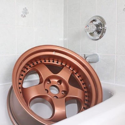
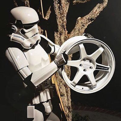
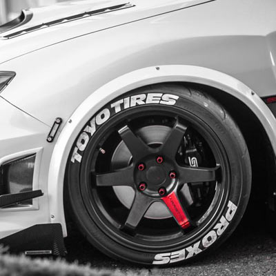
Varrstoen’s audience is immersed in a street forward aesthetic that feels candid and self produced. We adopted elements of collage, copy printing, and an irreverent attitude as elements to define photography standards and product presentation.

Bringing Varrstoen's brand culture to the commerce experience
We wanted build a proper home for the Varrstoen community, to broaden their reach beyond coastal cities, and showcase the true extent of their dedication to creativity. We worked to allow the audience to organically discover brand stories. This includes behind the scenes moments, insights and recaps from their team and ambassadors. Ultimately serving to curate their product, and drive the emotional connection through authenticity.
An experience-focused responsive strategy
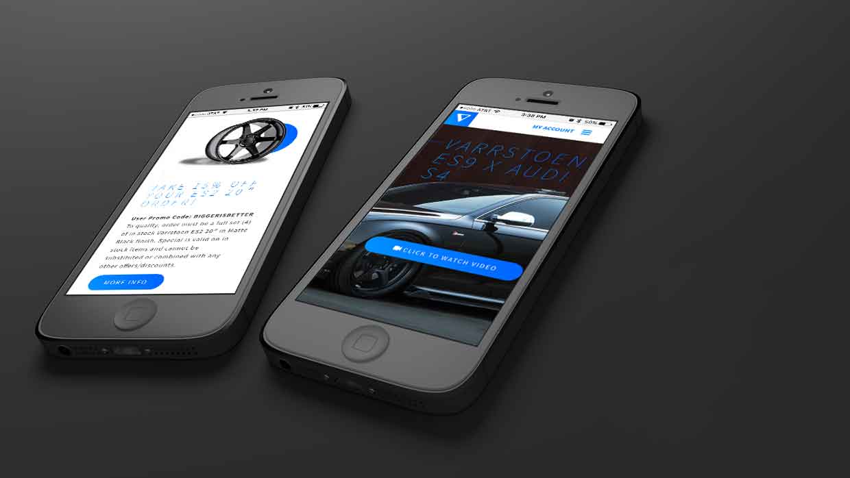
The entire site is designed responsively with adaptations to the user journey across mobile, tablet, and desktop devices. Our goal was to provide the optimum browsing experience while maintaining the primary features and site content regardless of form factor. We implemented a mobile specific navigation, simplified the filtering system, and replaced carousel clicks with swipe gestures. With this mobile-first approach, we were able to streamline the browsing and shopping experience.