Revitalizing a fabrication technology brand for the new generation of clientele.
The Story
A brand name reborn
The most authentic future-proof strategies are often rooted in respect for the past. When we were given the task of breathing new life into this high-end machine company, our research revealed that Sterling Fabrication Technology is a fabrication dealer built on a legacy of precision and efficiency. It was known for standing out and innovation. We borrowed from its storied reputation and the name Sterling Fab Tech was reborn.
Challenge
Challenge
Sterling Fabrication approached us with the unique challenge of articulating it’s new vision.
Our key objective was to develop a flexible identity platform that would evolve over time while remaining culturally relevant. The idea had to be broad enough to encompass the diverse set of potential experiences with the ability to attract a new generation of business professionals.
Challenge
Defining brand strategy
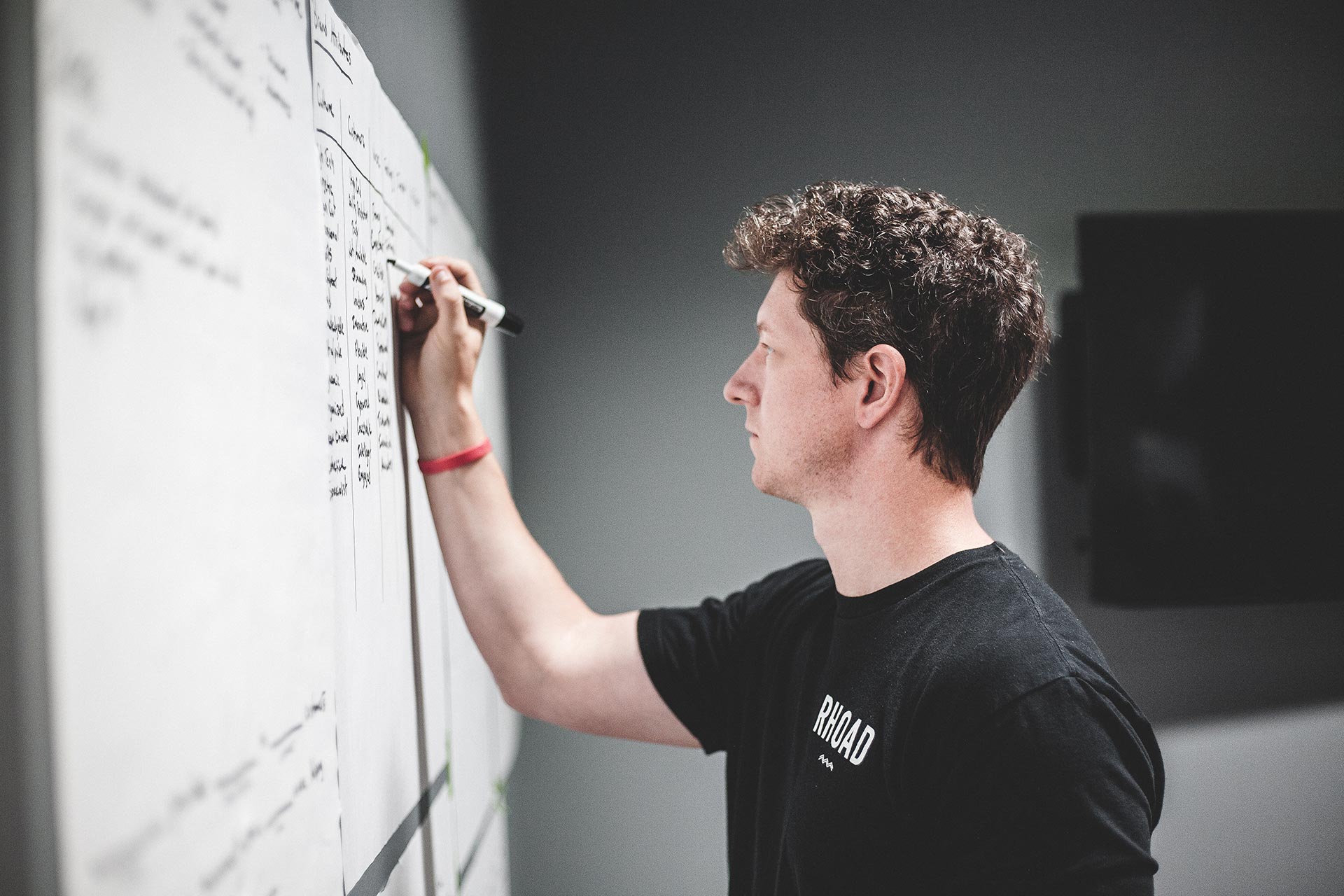
To establish creative direction and inform some design decisions for the future community, we conducted an Discovery Workshop of Sterling’s history, its long-term goals, and strategic plans. The workshop consisted of interviews with key stakeholders, employees, business owners, clients, and operators.
The entire project kept its focus on the production realm and that statement represents our outlook better than most. The key was to make a mark and not just a generic blur of gradients and mediocrity.
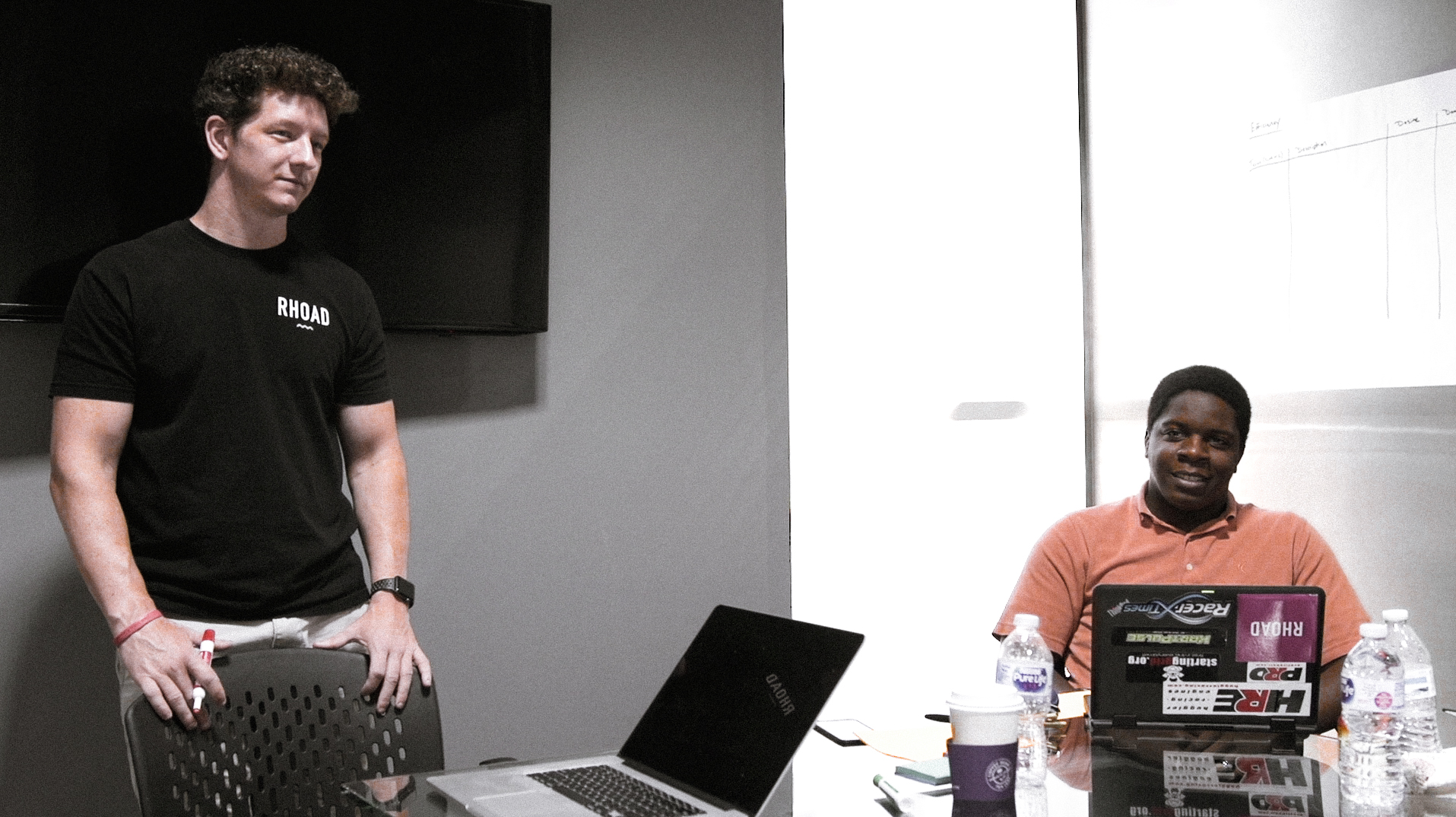
The project was initiated after a brief conversation between Studio Rhoad’s Founder, Chris Rhoad and Sterling’s President agreed that the entire executive team needed to fly out to Sterling’s offices in Dallas for a 2 day Discovery Workshop.
Defining the brand creates an objective roadmap; a decisional filter for all the company’s future decisions. By checking against this statement, we can quickly see whether any decisions will help or hurt, focus or muddy, purify or modify the brand.
An in-depth strategy session was conducted. What emerged was a clear brand story and voice for Sterling.
Discovery Workshop
Rebrand
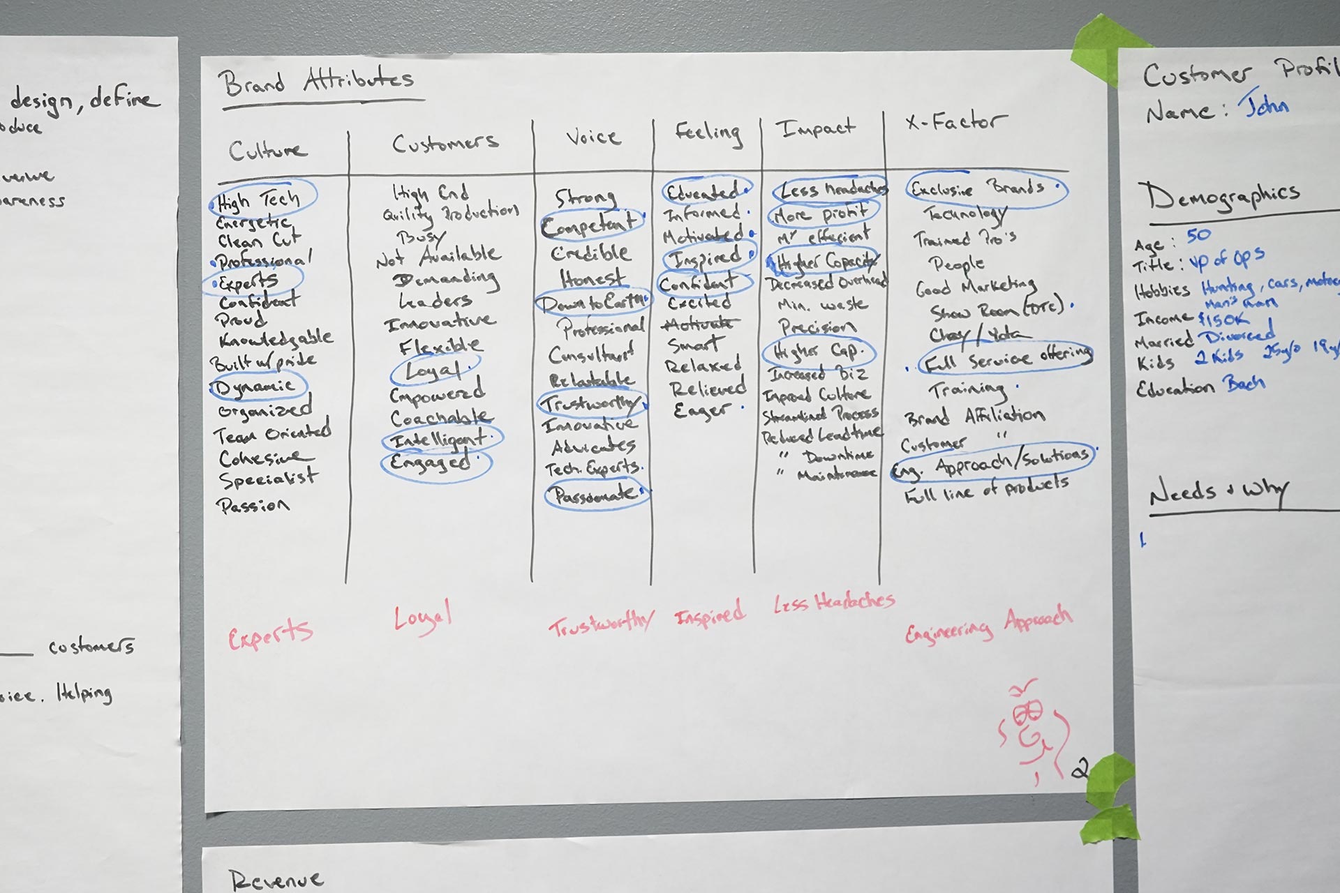
During the brand attributes exercise, a pattern emerged in the cluster of words. “Experts, inspired and engineered approach” which spoke to a more bespoke experience, while “Loyal, trustworthy and inspired” touched upon the old fashioned values of this family owned and operated business.
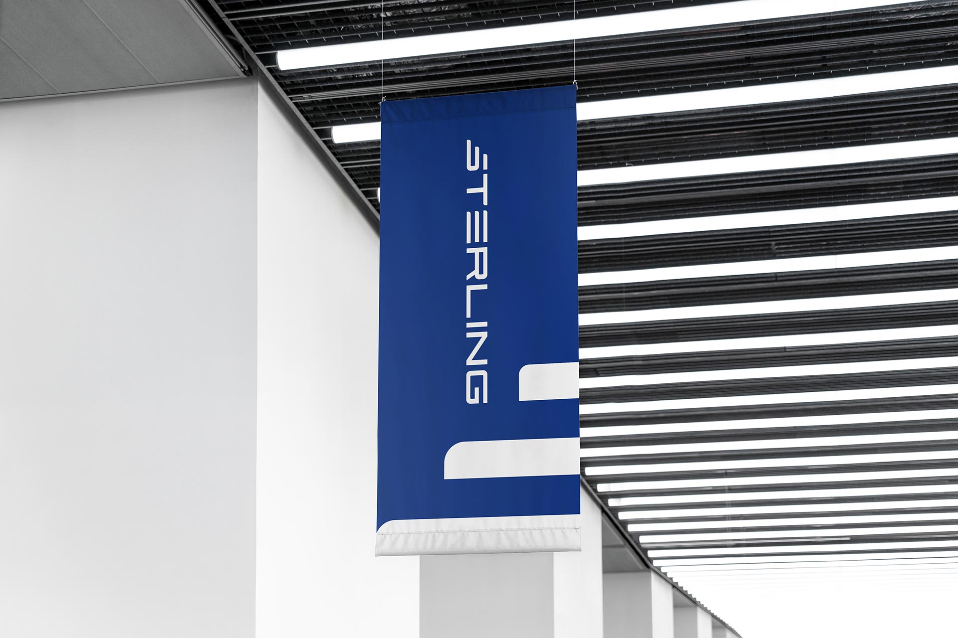
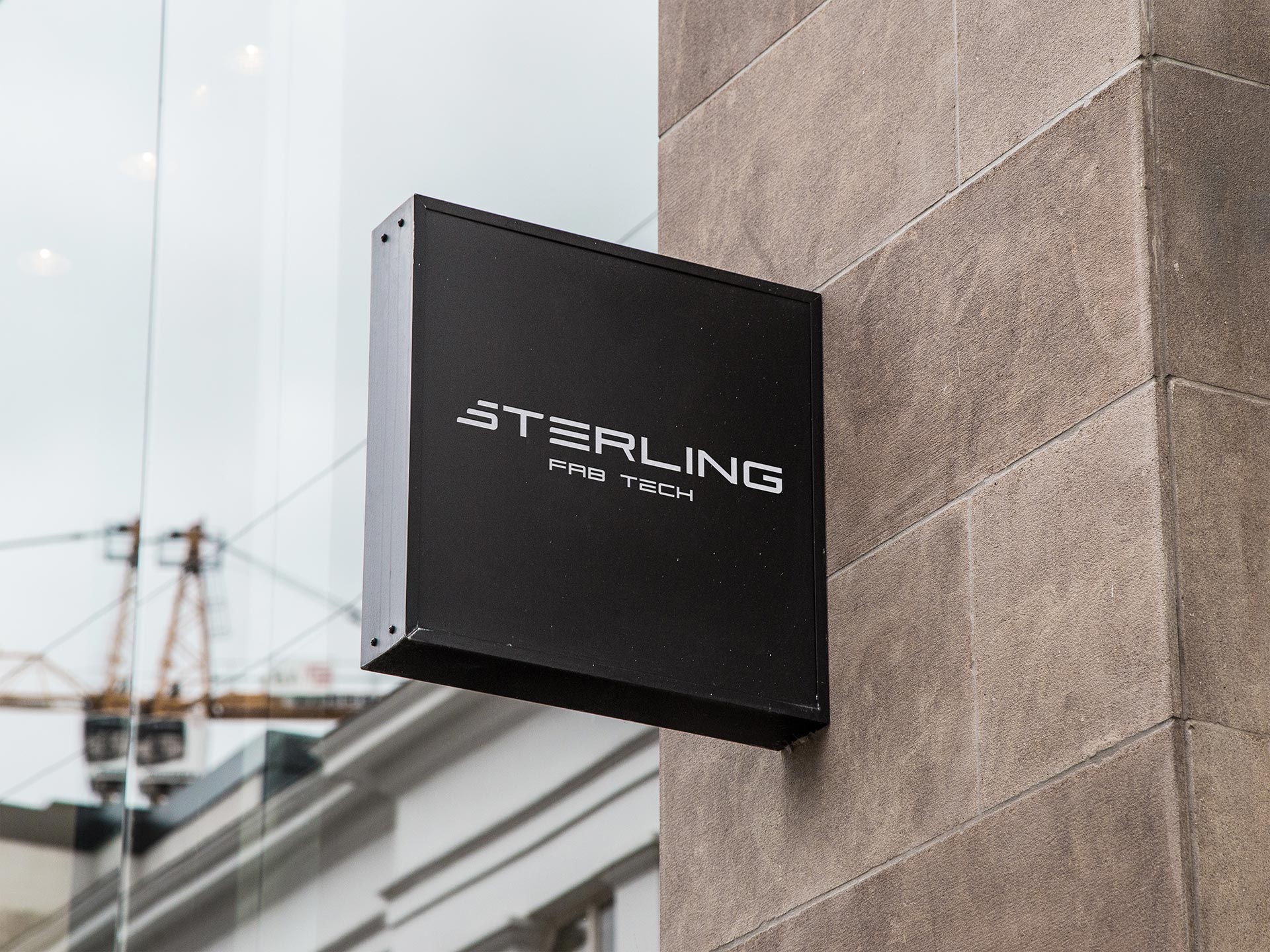
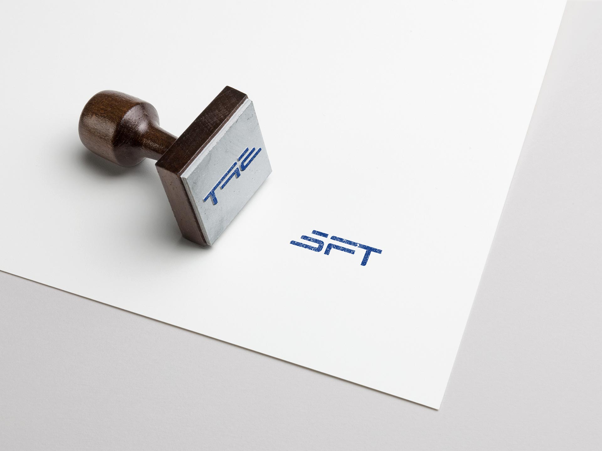
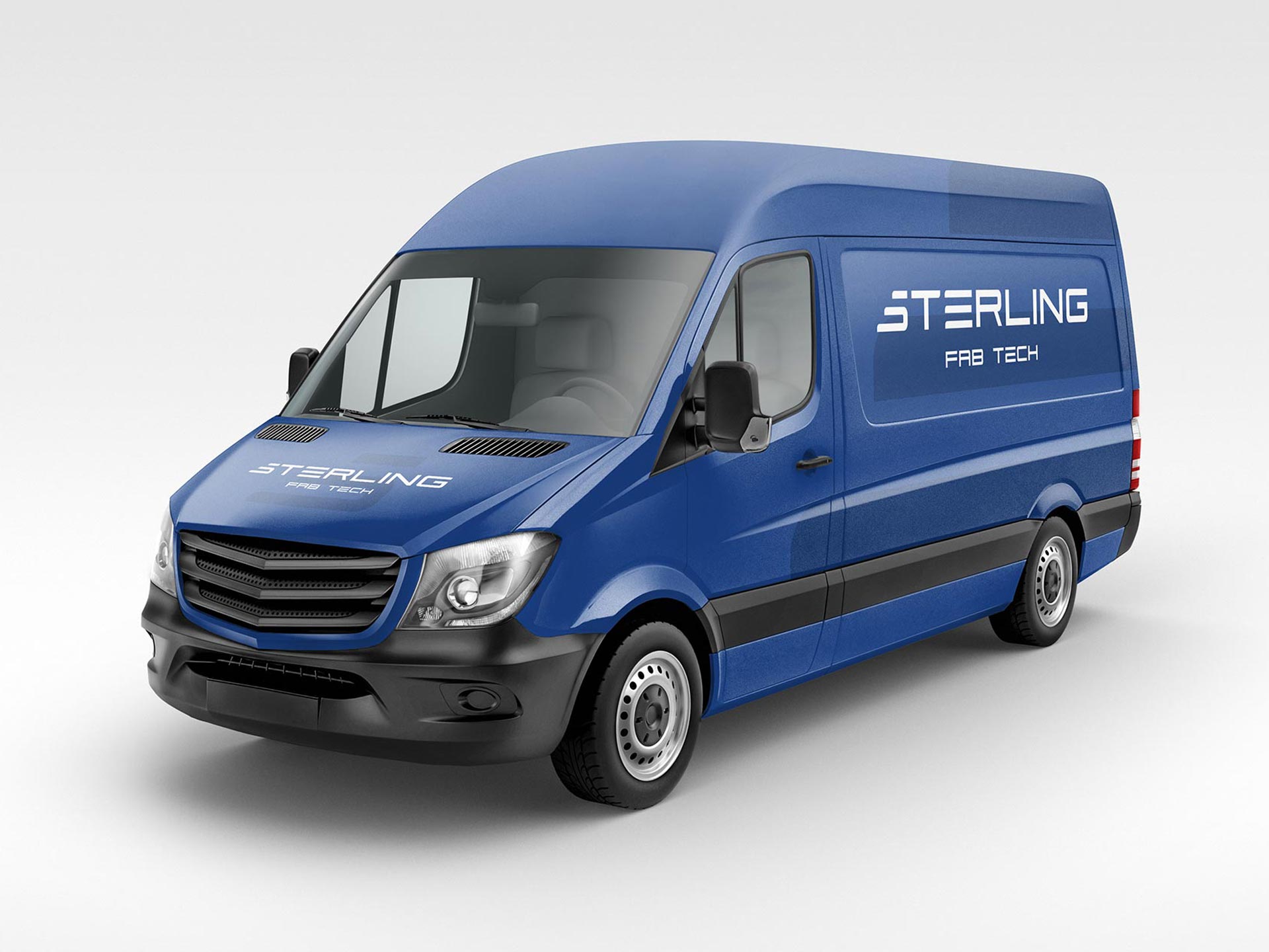
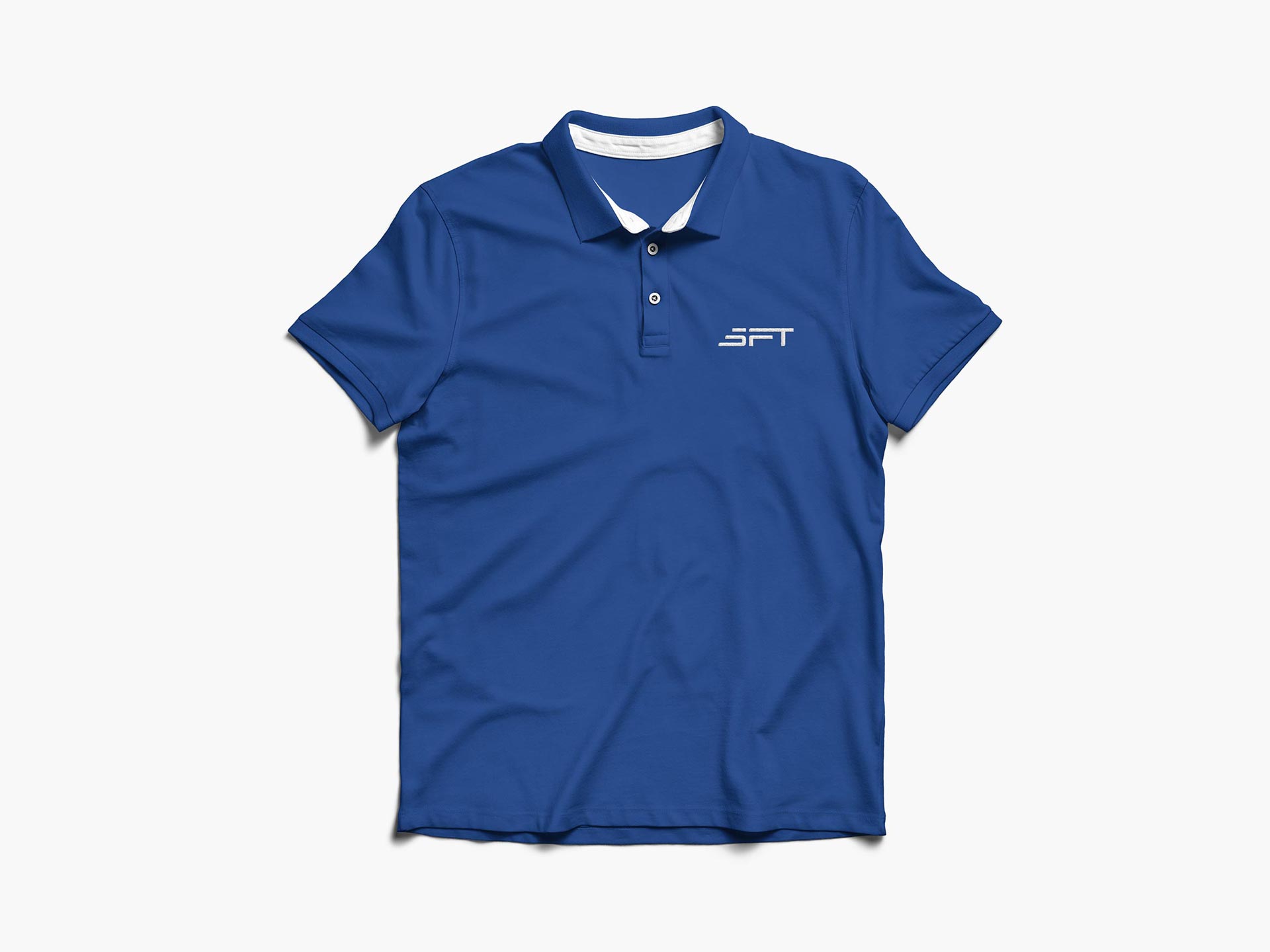
Once the creative tone was set, the team quickly went to work to capture a new identity system that reflected the “precise efficiency” aesthetic. Working with custom designed typefaces, the design team created a unique logo mark.
Old vs New
The original Sterling logo featured a bold, steady typeface accompanied by fairly generic gradients that a little cold in its digital execution.
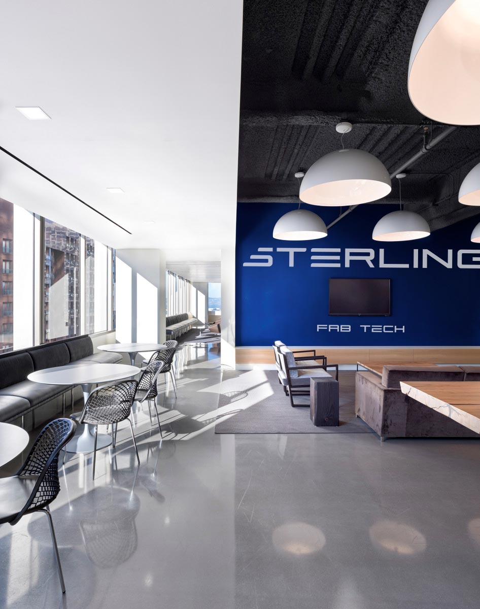
The new logo is completely revised with precision, accuracy and an emphasis on speed and precision.
A flexible system
Our many concepts and explorations brought us to a simple and flexible solution. We created a design system that reinforced a sense of strength and accurancy. The final design language is based around the logo and mark of the company: a customizable ‘S’ that represents the machinery at its heart. It allows for continuous flexibility and future growth; its simplicity speaks to a diverse range of people, inviting each to create their own relationship with the brand mark.
The design language and identity system we established was executed across various touch-points, building an identity that will become synonymous with fabrication technology and its the bright future.
Behind The Scenes
Behind The Scenes
There’s something seriously broken with the automotive industry’s marketing and nobody is willing to admit it publicly. That’s OK, because I’ll be that guy. I’ll take one for the team and tell you how it is.
How Much Should You Invest?